01
/portfolio
Subjects & Systems
Visual Systems Coursework / ASU 2024
Visual Exploration
Interaction Design
Information Design
Scroll Immersion
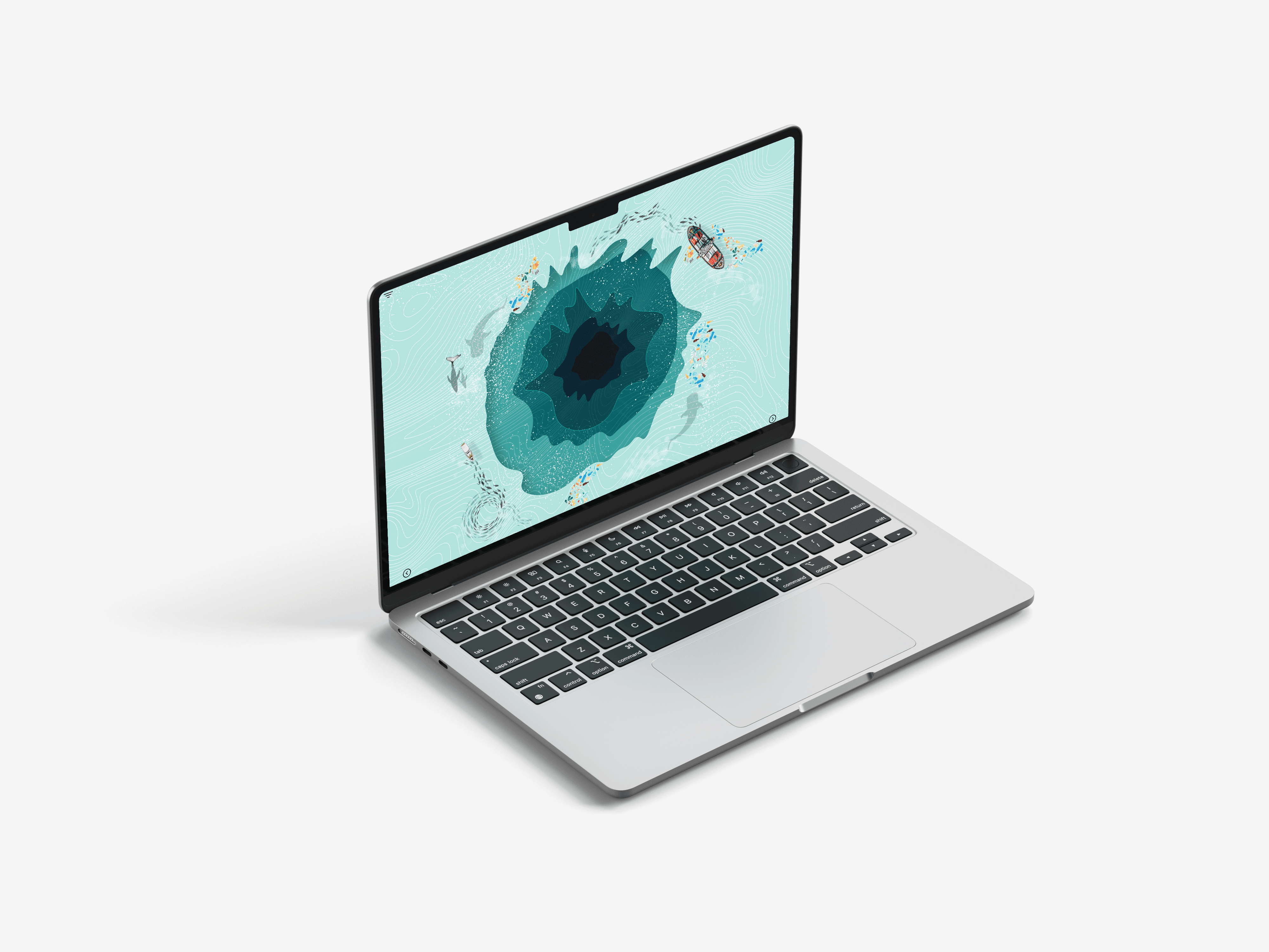
How far can a screen take you?
The Project
This was a coursework exploration, not a client problem, not a product brief. The outline was open: pick subjects, build visual systems around them. I chose water sustainability, partly because of research I'd already done for my architecture thesis on Aquapolis, and partly because water as a subject resists easy visualization. It's invisible, it's systemic, it moves.
The real question I was chasing wasn't about water. It was about immersion, how does a viewer move from one piece of information to the next in a way that feels inevitable rather than instructed? How does scroll become experience rather than navigation?
That's what this project is really documenting:
My first serious attempt at thinking through visual mapping and interaction sequencing, before I had the vocabulary to name it properly.
The Process
It started in the sketchbook.
Before anything went into Illustrator or Figma, I mapped the relationships between subjects on paper, arrows, clusters, hierarchies that kept collapsing and reforming. The sketches from this phase are the most honest record of how the thinking evolved: messy, directional, full of dead ends that became the actual structure.
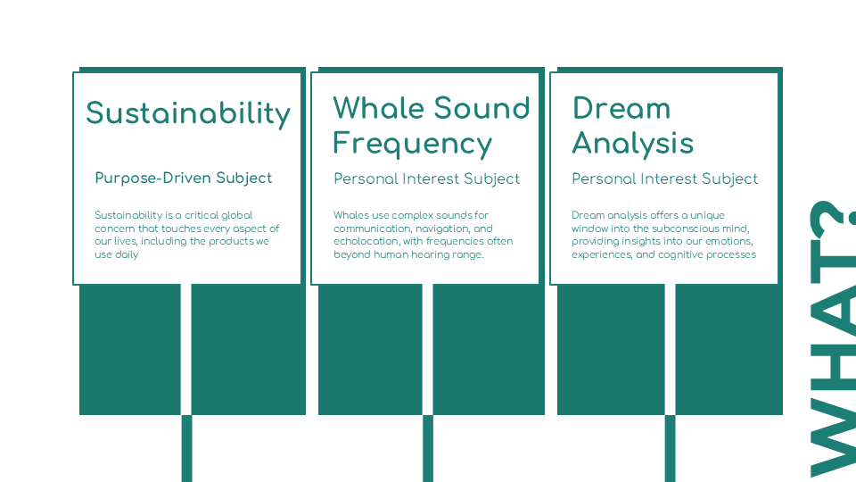
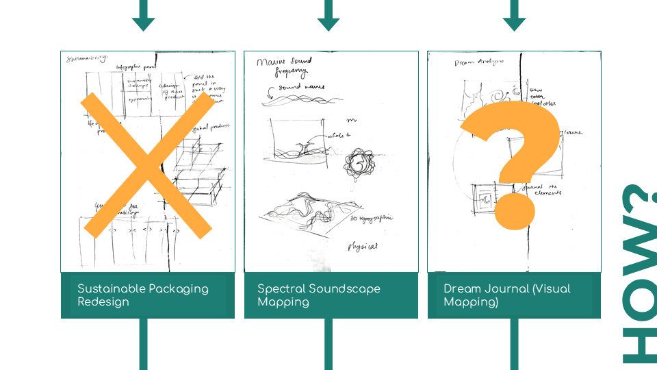
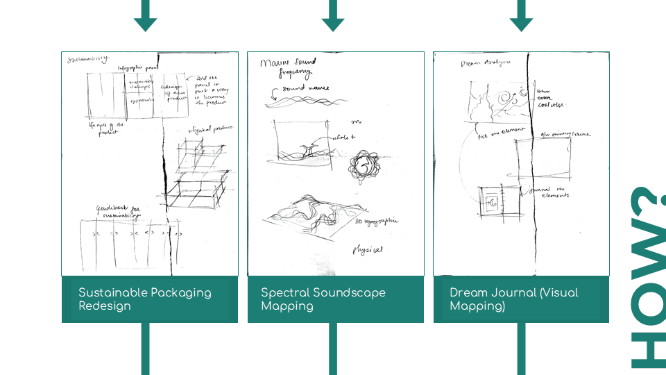

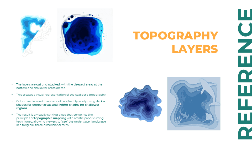
From the sketches, visual languages emerged per subject, not imposed, but pulled out of what each subject actually is. Water sustainability pushed toward flow and layering. The underwater acoustics of whale vocalizations pushed toward radial, frequency-based forms. Dream analysis pushed toward fragmentation and non-linearity.
The interaction question: how does a viewer move through this, came later, once the visual logic per subject was clear. Scroll immersion as a concept emerged from asking: what if the transition between screens was as designed as the screens themselves?


What I Learned
This project taught me that visual systems aren't decoration for information, they're an argument about what the information is. The form you choose shapes what a viewer understands, what they feel, and how long they stay.
It also taught me something about my own process: I think better on paper before I think on screen. The sketchbook phase here wasn't prep work, it was the actual design work. Everything that came after was translation.
I came into this project as someone trained in architecture, trying to figure out what interaction design meant to me. I left it with a clearer answer: it's spatial thinking applied to time. A screen is a room you move through, not a surface you look at.

Video Prototype
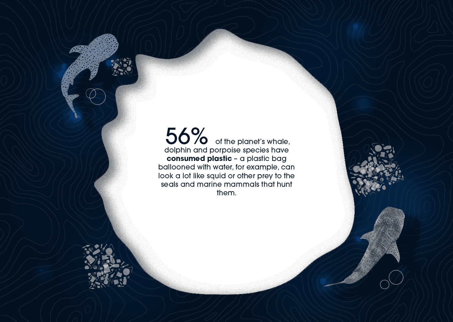
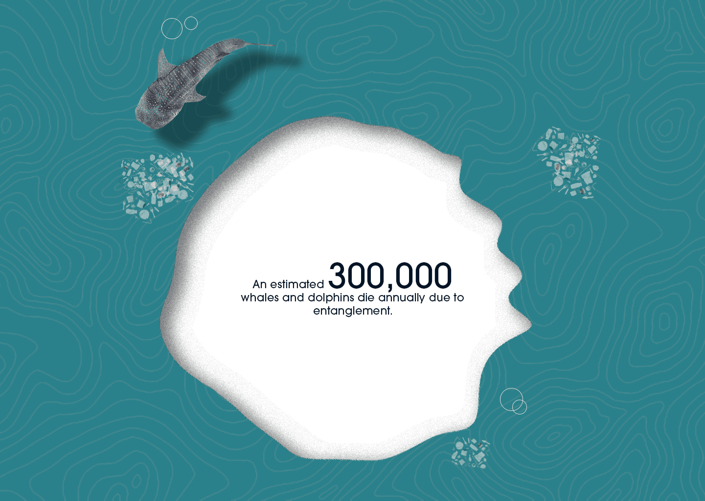
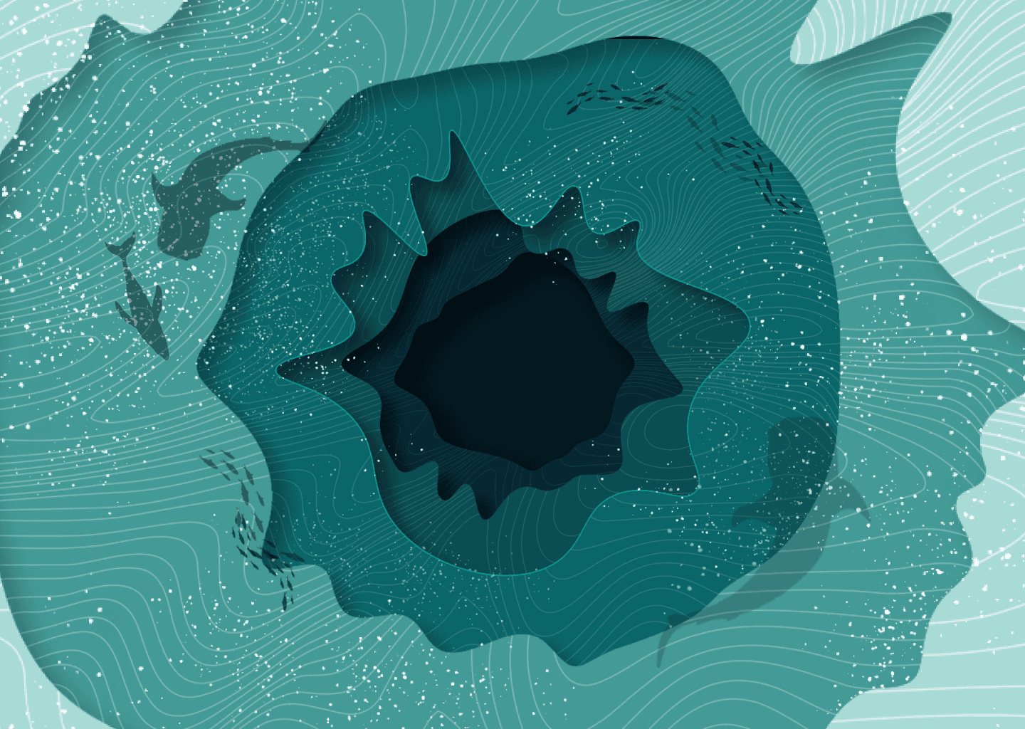
Scroll immersion across water sustainability, acoustics, and dream states.
02
/see more

