01
/portfolio
Designing for Water Literacy
Arizona Water Innovation Initiative / 2025
UX Research
Environmental Data Visualization
Exhibition Design
Systems Thinking

Exhibition Design for Water Literacy
The Challenge of Invisible Systems
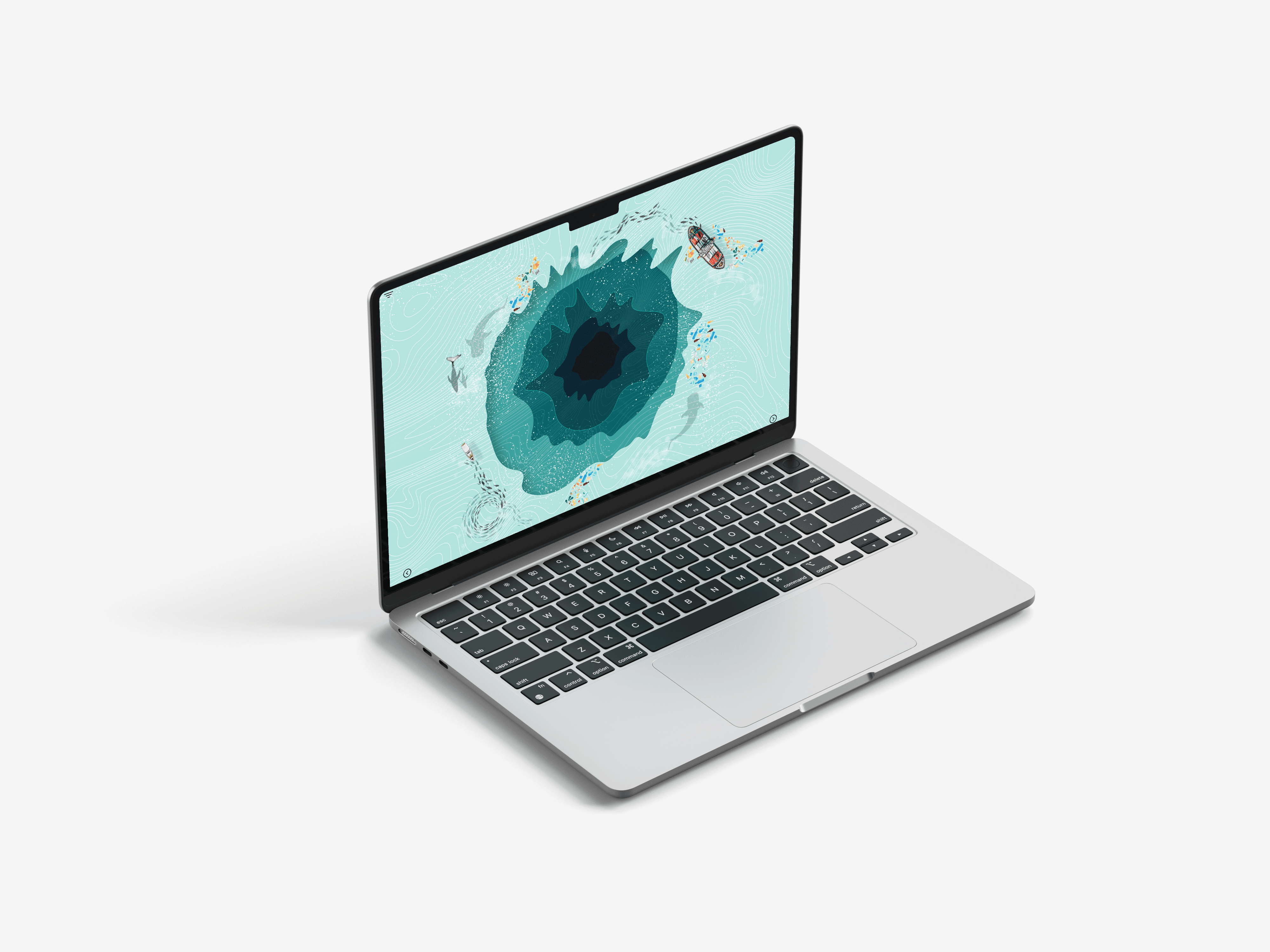
Groundwater is essential to Black Canyon City, yet it remains largely invisible and difficult for residents to understand. Complex concepts like aquifers, contamination, and water demand are often fragmented or overly technical, limiting community awareness and engagement.
Why this matters?: When essential systems remain invisible, users disengage. Clear, intuitive visual design reduces cognitive load, builds trust, and enables informed environmental decision-making.
What I Set Out To Learn
Rather than starting with visuals, I framed the work around three guiding questions:
How do residents currently understand where their water comes from and how it is managed?
Which representations (visual, spatial, conversational) most effectively support comprehension and trust?
What misconceptions or gaps prevent residents from engaging with water conservation practices?
Research & Evaluation
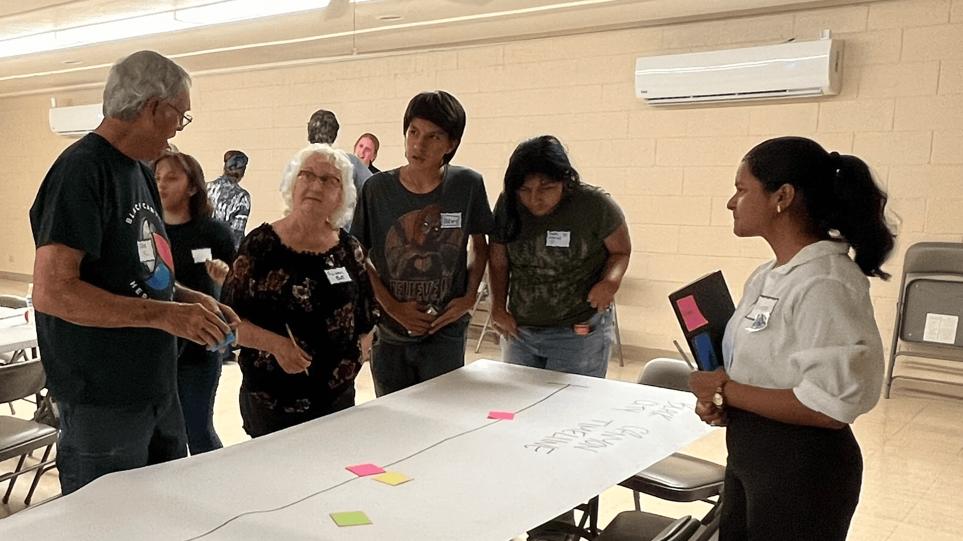
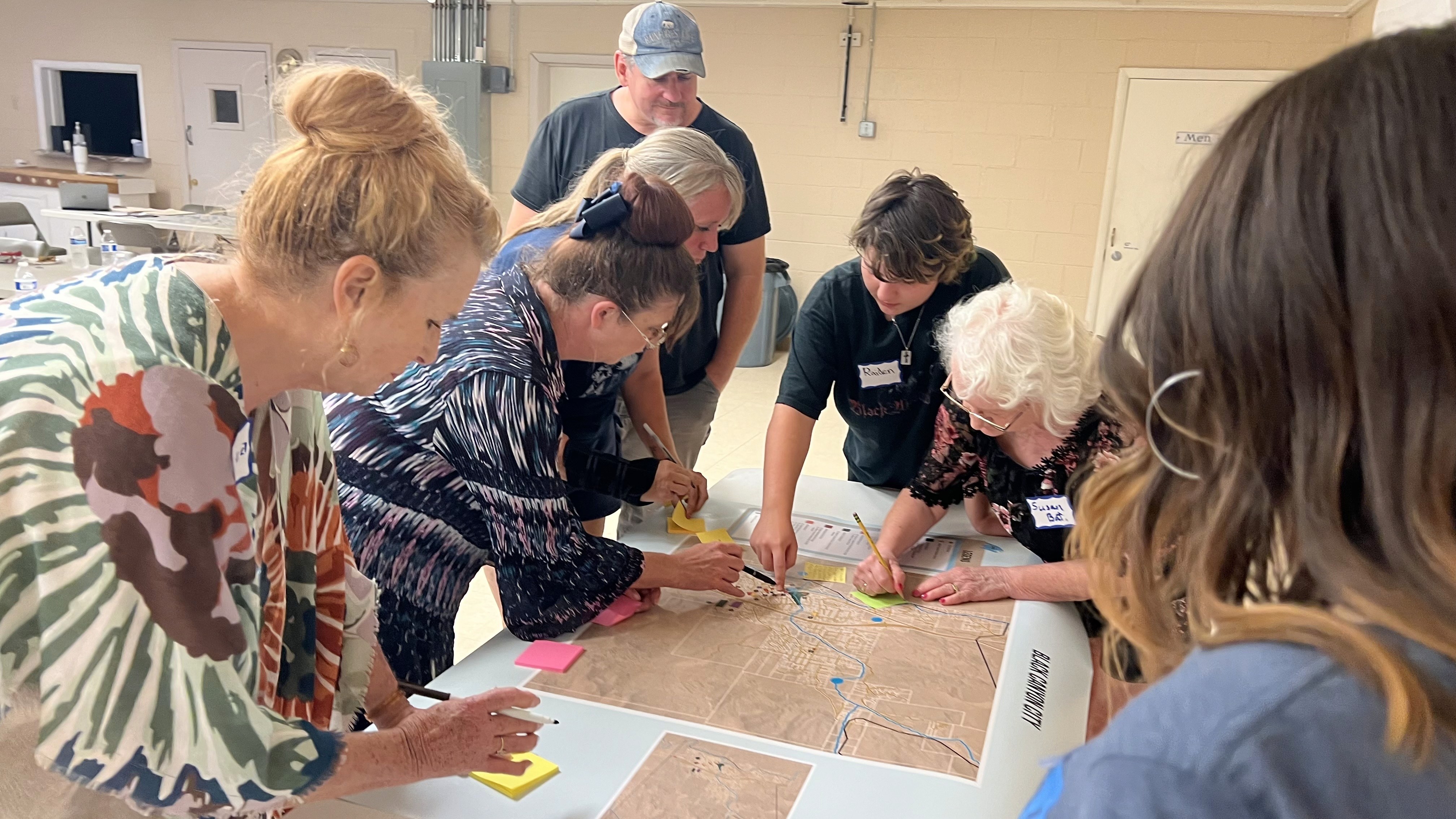
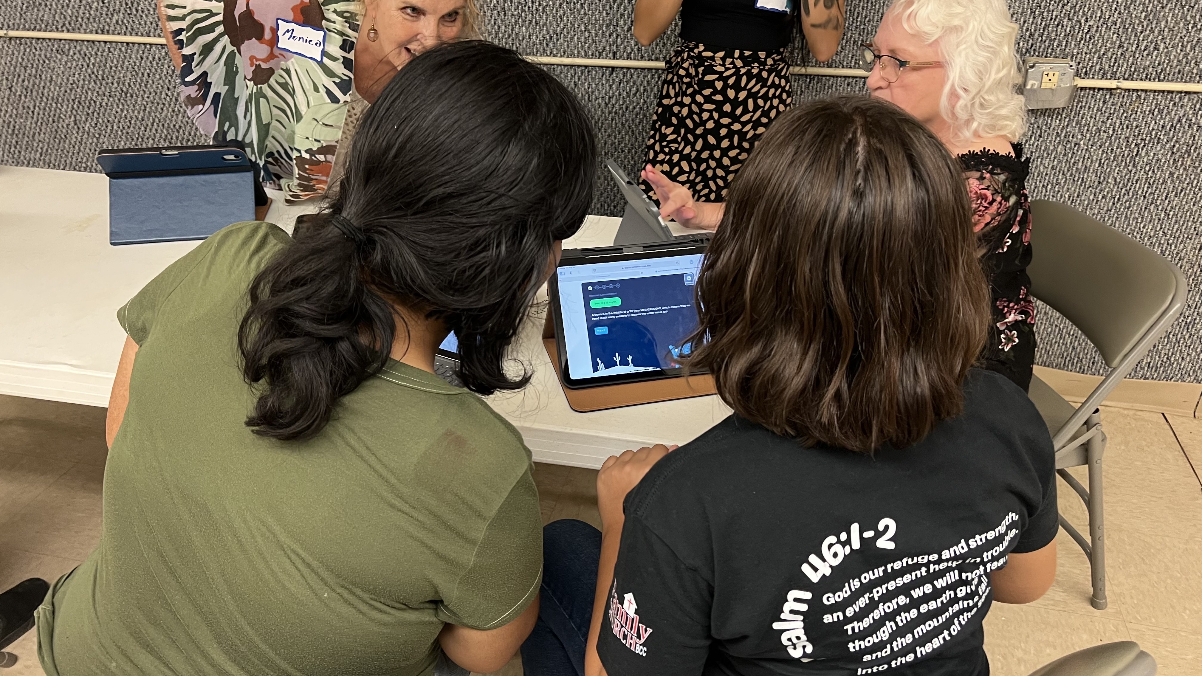
User research was conducted through moderated interviews and focus-group sessions with Black Canyon City residents to understand how community members perceive groundwater and local water systems. Participants engaged with groundwater and conservation concepts through multiple modalities, including illustrated explanations, immersive VR experiences, and a conversational water chatbot allowing us to evaluate comprehension across different learning styles.
Real-world Constraints
Five real-world constraints shaped every subsequent design decision: a traveling exhibit with variable room sizes and layouts, mixed audiences (K–12, adults, educators), limited time-on-task and group-based movement, accessibility challenges (height, reading ability, tech hesitation), and NDA constraints on select government-facing materials.

Concept Exploration
Sketches and spatial studies explored how scale, layering, and narrative flow could support learning across physical and digital touchpoints. Early concepts tested whether an exhibit could feel less like a museum wall and more like a walkable diagram, where visitors moved through the water system rather than reading about it.


The Deliverables
The exhibit produced several distinct elements, each responding to a specific research insight:
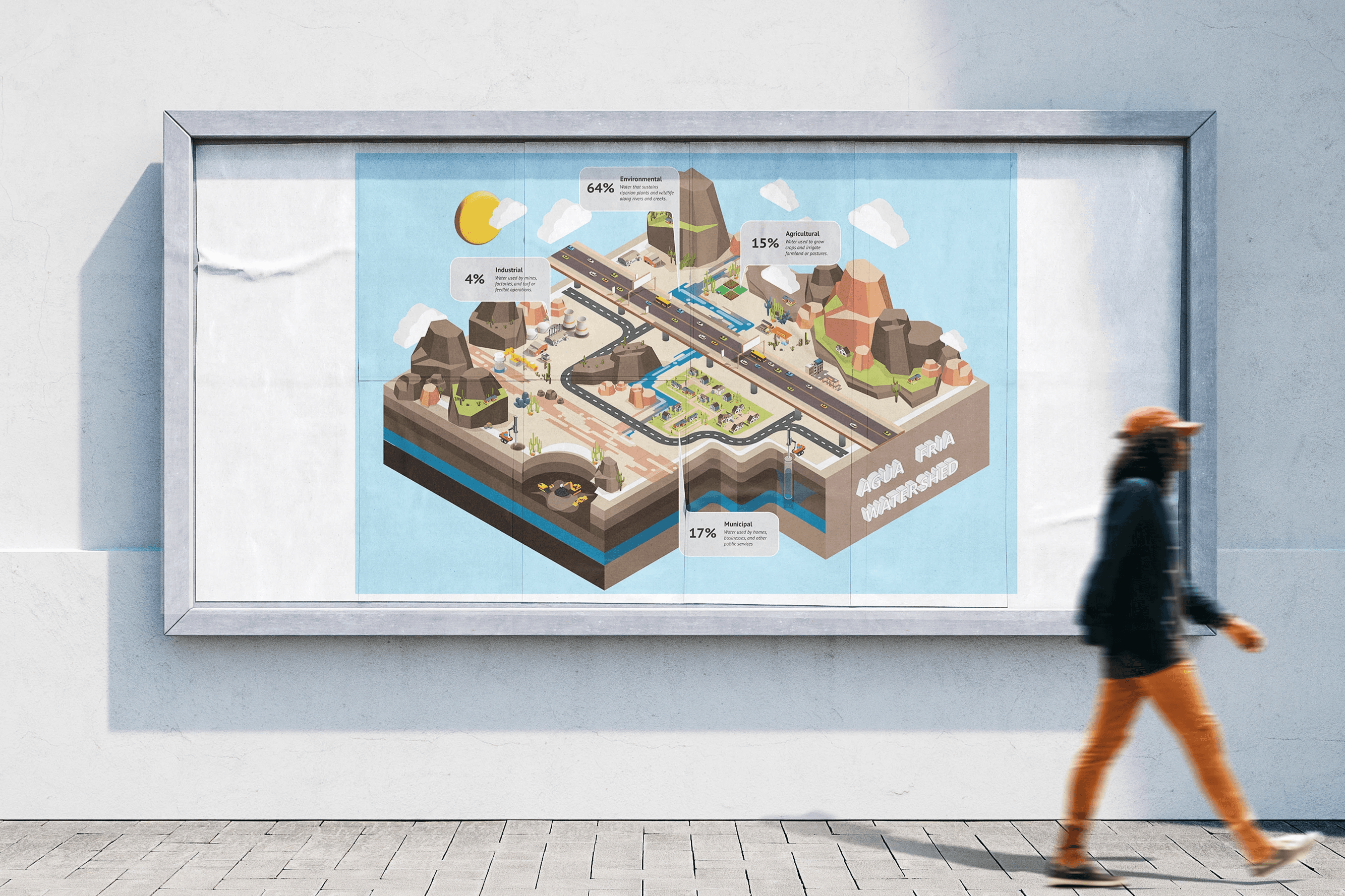
Agua Fria Watershed Isometric Mural
A large-scale mural grounding the exhibit in local geography, translating aquifer geology into a spatial narrative.
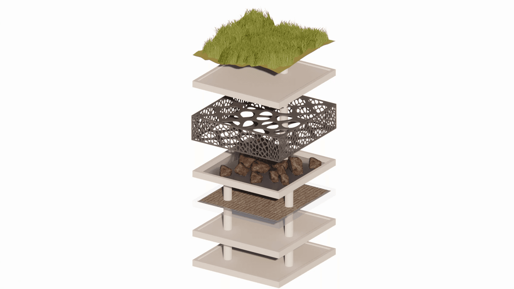
3D Exploded Aquifer Model
Physical and digital renderings, making underground systems visible and touchable.
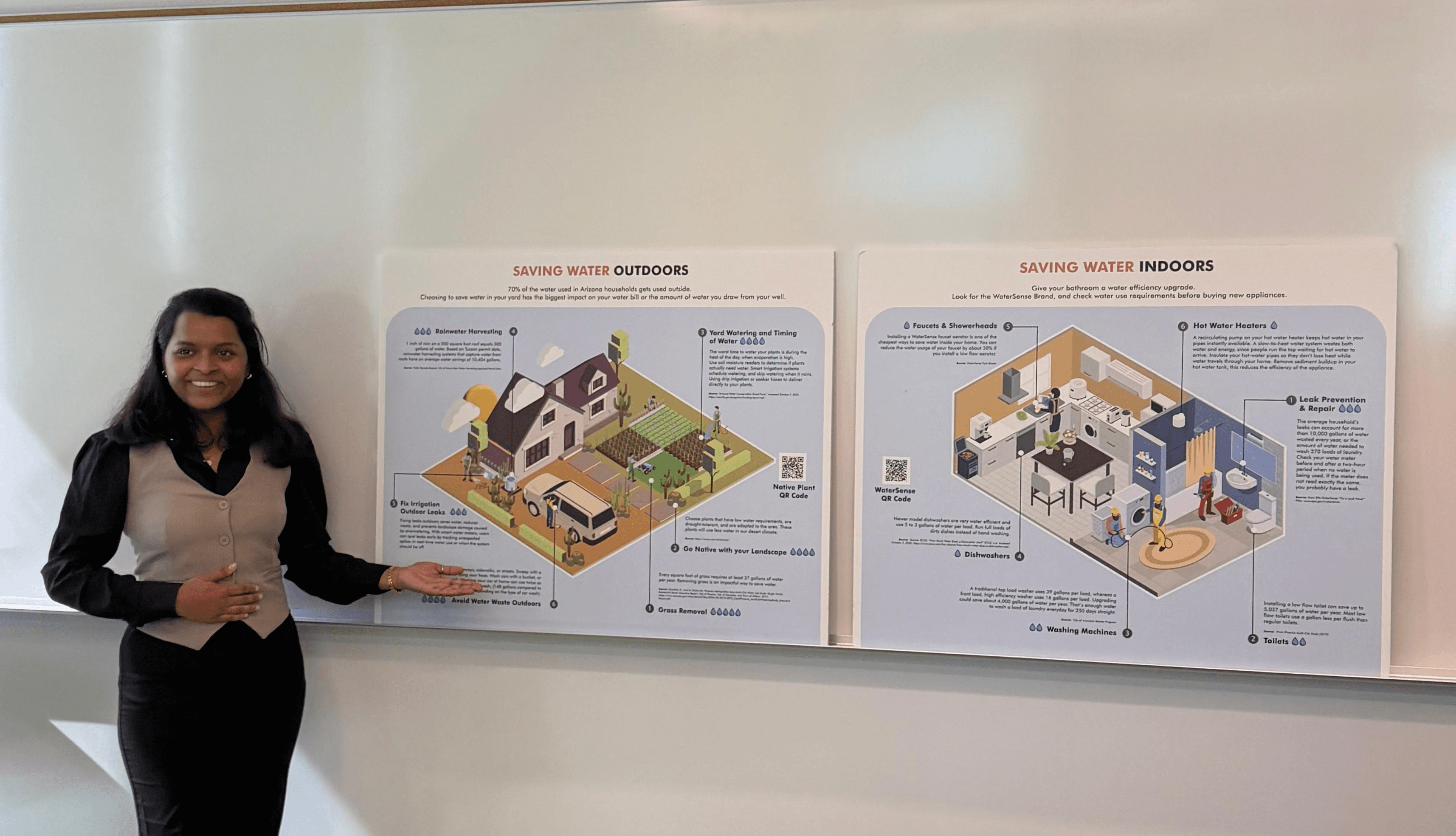
Indoor & Outdoor Water-Saving Infographics
Modular, action-oriented posters designed to reduce intimidation and encourage conservation behavior.
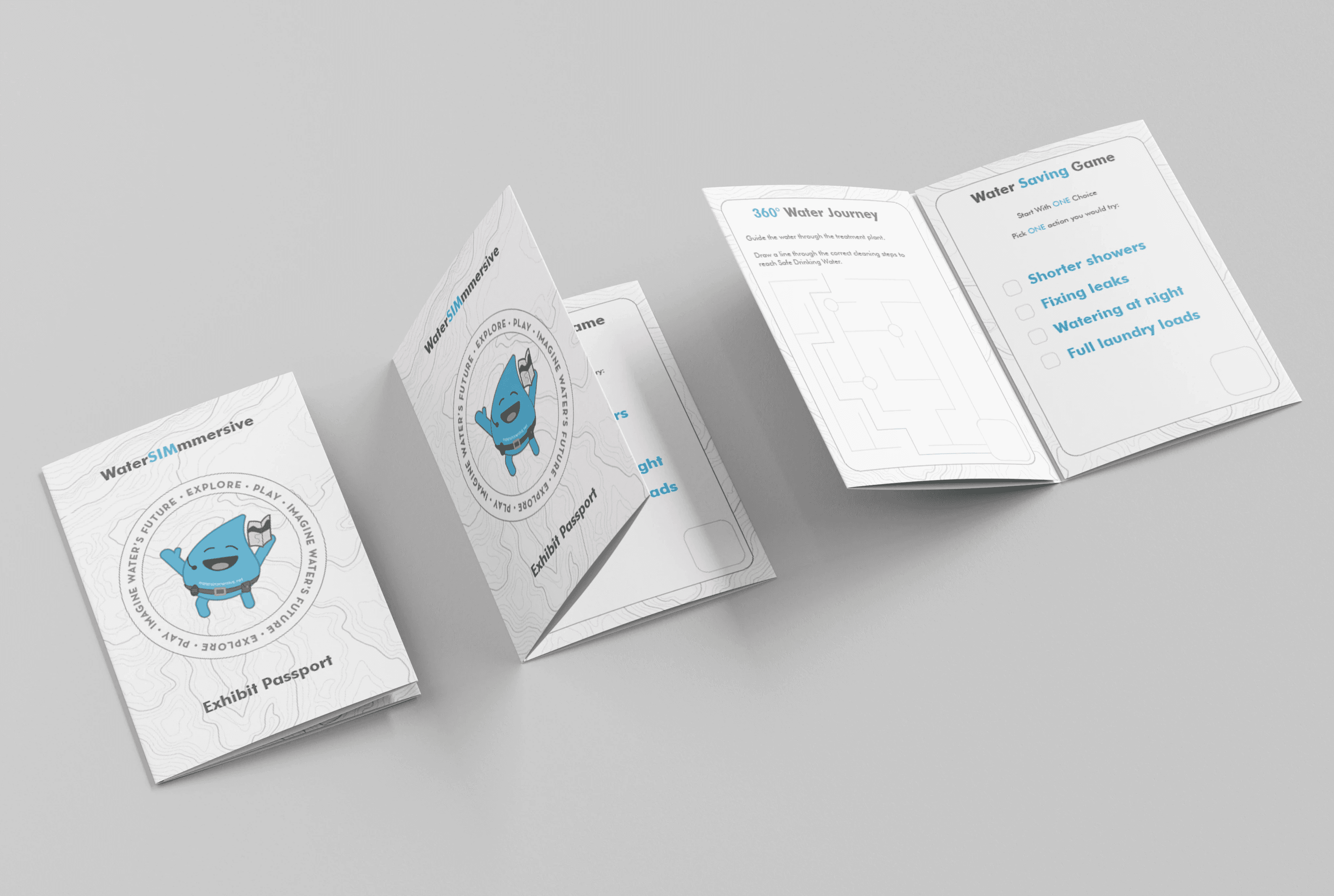
AWII Exhibit Passport
A take-home artifact designed to extend engagement beyond the exhibit visit and connect the traveling program across its 8 Arizona city stops.
What the Exhibit Achieved
The final exhibit made underground water systems tangible through the exploded aquifer model, increased trust and relevance by grounding visuals in local geography, supported progressive learning through layered modular infographics, and encouraged conservation behaviors through clear, action-oriented messaging. Calm, accessible visual language reduced intimidation around technically complex topics.
What Usability Testing Revealed
Watching visitors move through the space surfaced insights no wireframe could have predicted:
High-engagement technologies (VR, motion-based games) created traffic bottlenecks when placed near entrances
Large-scale animated installations drew social attention but competed with adjacent content
Users hesitated to interact with unfamiliar technology without explicit permission cues
Dense text reduced approachability; larger typography increased engagement across ages
Writing-based activities were avoided when spaces felt crowded or transitional
These observations led to concrete iterations: increased text scale on water-saving displays to reduce intimidation for younger users, revised signage language to remove obligation-heavy terms, and spatial adjustments to redistribute visitor attention across the exhibit floor.

Reflection
Designing for physical, public environments reinforced that usability extends beyond screens. Observing how people move, hesitate, and gather revealed insights that no wireframe or prototype could surface alone. The methods were UX methods (research, iteration, testing) but the output was a room. That gap between method and medium is where this project taught me the most.
02
/see more