INTRODUCTION
An intelligent wellness interface redesigned to simplify navigation, improve accessibility, and support seamless session continuity. Guided by heuristic audits, user testing, personas, and prototype validation, the system resolves key friction points to deliver a more efficient and intuitive meditation experience.
MY ROLE
UX Designer (Research, Accessibility, Prototyping)
TIMELINE
8 weeks
THE TEAM
Individual project (research-led redesign)
TOOLS USED
Figma, Accessibility tools, User testing
THE CHALLENGE
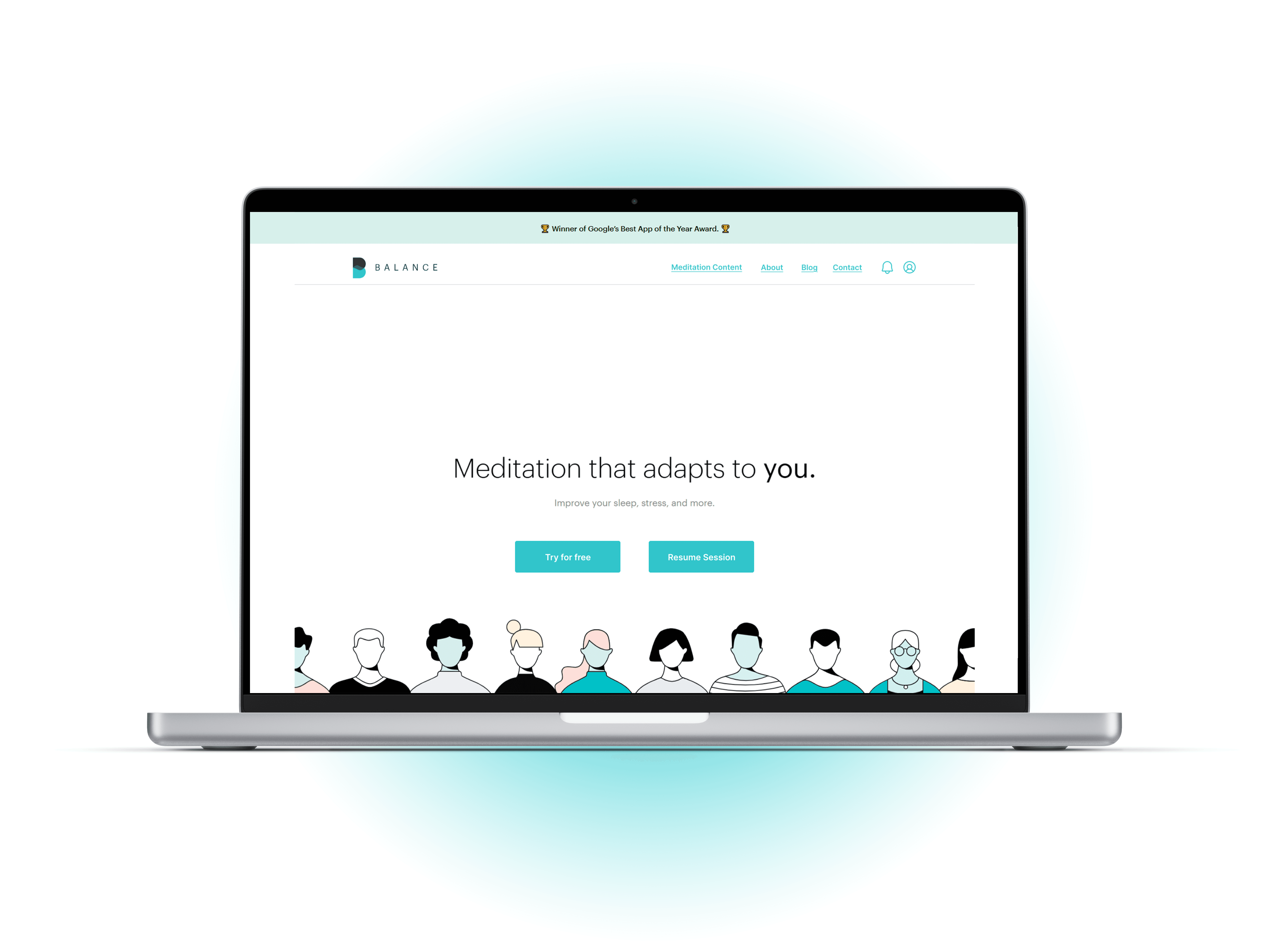
Balance offers science-backed meditation content, but the website experience introduced friction that disrupted calm and continuity. Returning users struggled to log in and resume sessions, navigation lacked recovery paths, and accessibility gaps made core actions harder to complete. These issues weren’t cosmetic, they directly affected task success, trust, and inclusivity.
Why this matters?: For a wellness product, friction undermines the core value proposition i.e., the ease, calm, and consistency.
WHAT I SET OUT TO LEARN
I approached this redesign with three guiding questions:
1. "Where do users experience friction when trying to resume or continue meditation?"
2. "How do navigation and IA choices impact discoverability and confidence?"
3. "Which accessibility gaps meaningfully affect task completion?"
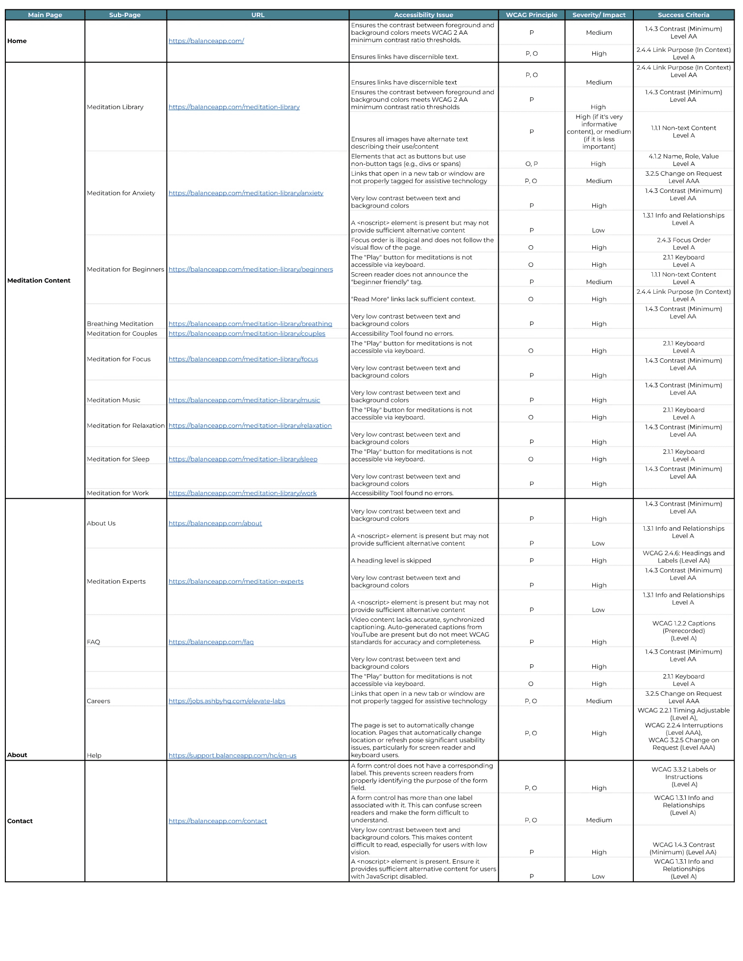
RESEARCH & EVALUATION
Methods Used were Heuristic Evaluation (Nielsen), WCAG Accessibility Audit, User Surveys, Task-based Usability Testing, Personas & Journey Mapping.
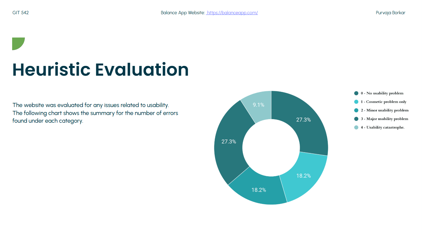
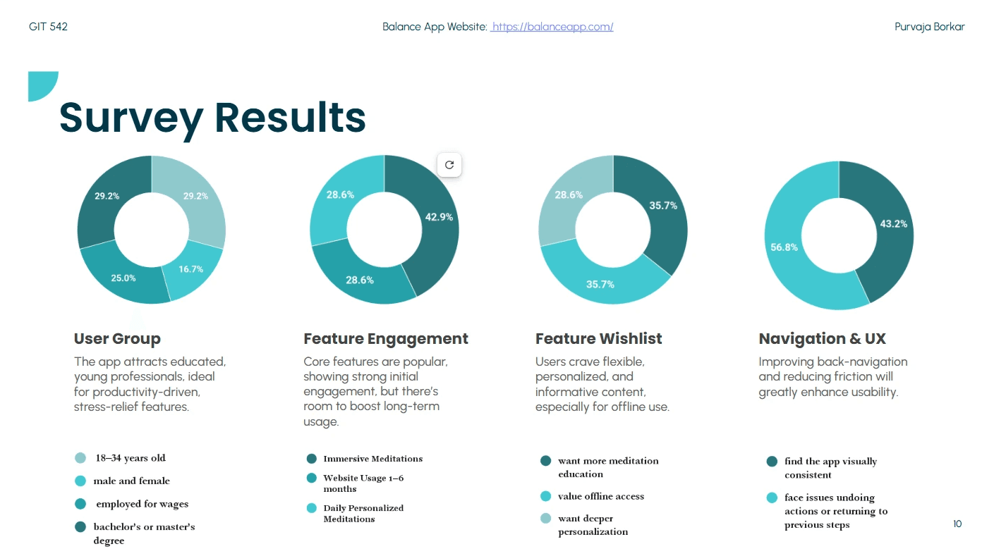


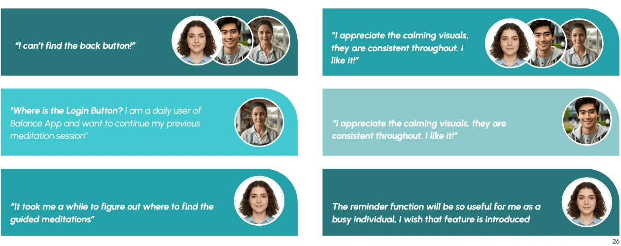
KEY FINDINGS
Across methods, the same patterns emerged.
DESIGN STRATEGY
Rather than redesigning the entire interface, I focused on strategic interventions that improved continuity, clarity, and accessibility without increasing cognitive load.


Accessibility was treated as a core design constraint. I audited contrast, focus order, keyboard navigation, and semantic clarity, and integrated WCAG-aligned fixes directly into interaction design.
IMPACT & VALIDATION
While this was a conceptual redesign, usability testing and peer review indicated clearer navigation, reduced confusion, and faster task completion for core flows.
LEARNINGS
This project reinforced how small structural decisions (like recovery paths and accessibility) can dramatically change how calm or frustrating an experience feels.
WHAT I’D DO NEXT
With engineering collaboration, I would next validate these changes through A/B testing, expand accessibility testing with assistive technology users, and explore personalization to further support long-term engagement.